
COLOR THEORY IN UI/UX DESIGN
A practical guide to color theory in UI/UX design, covering color harmony, saturation, brightness, contrast, WCAG 2.2, semantic color systems, light and dark mode, the 60–30–10 rule, and real-world color palette applications for digital products.

On this page
- 1. Introduction: Why Is Color Important in UI/UX Design?
- 2. Fundamental Principles of Color Theory
- 2.1. Color Wheel
- 2.2. Color Harmony
- 2.3. Saturation, Brightness, and Hue — Three Essential Color Properties
- 3. Color Contrast
- WCAG 2.2 Standards
- 4. Color Psychology in Design
- 5. How Professional Designers Use Color in Websites and Applications
- 5.1. Using Color to Establish Visual Hierarchy
- 5.2. Building a Color System Instead of Selecting Individual Colors
- 5.3. Designing Light Mode and Dark Mode
- 6. Analyzing Good and Poor UI Design Examples
- Left: Poor UI Design
- Right: Good UI Design
- 7. Practical Guide: How to Build a Color Palette for UI/UX Design
- 7.1. Start by Defining Design Goals
- 7.2. Apply the 60–30–10 Rule
- 7.3. Three Practical Color Palettes
- 7.4. Color Selection Workflow for UI/UX Projects
- 8. Tools for Color Theory and UI/UX Design
- Adobe Color
- Coolors
- Figma
- WebAIM Contrast Checker
- 9. Applying Color Theory Across Different Design Disciplines
- Color Harmony Analysis
- Conclusion
- Applying Color Theory to Improve UI/UX Design Quality
Color Theory in UI/UX Design: How to Combine Colors, Create Contrast, and Build Effective User Experiences
1. Introduction: Why Is Color Important in UI/UX Design?
Color is one of the most important elements in user interface (UI) design. It not only determines visual aesthetics but also directly influences how users perceive information, recognize interface elements, and interact with digital products.
A well-chosen color palette can help:
- Establish a strong first impression and brand identity.
- Create visual hierarchy and direct attention to important content.
- Help users recognize the states of buttons and interface components.
- Improve readability and accessibility.
- Evoke emotions and create a consistent user experience.
Conversely, uncontrolled use of color can make an interface visually overwhelming, difficult to read, or confusing in terms of component functionality.
Therefore, understanding the principles of Color Theory is essential for creating interfaces that are both visually appealing and user-friendly.
2. Fundamental Principles of Color Theory
2.1. Color Wheel
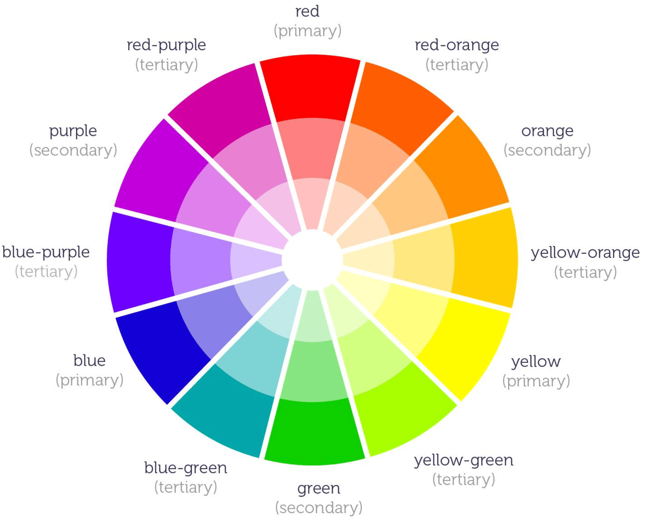
The Color Wheel is a visual tool that helps designers understand relationships between colors and identify harmonious color combinations.
In the traditional RYB color wheel, colors are divided into three main categories:
- Primary Colors: Red, Yellow, Blue.
- Secondary Colors: Orange, Green, Purple.
- Tertiary Colors: Red-Orange, Yellow-Orange, Yellow-Green, Blue-Green, Blue-Purple, Red-Purple.
In digital design, it is also important to distinguish between different color systems:
- RGB: Red, Green, Blue — an additive color model used for digital screens.
- HEX: A hexadecimal color code used in interface design and web development, such as #2563EB.
- HSL: Hue, Saturation, Lightness — a model that allows intuitive adjustments to color properties.
For UI/UX designers, HSL is particularly useful when developing multiple shades and variations from a primary brand color.
2.2. Color Harmony
Color Harmony refers to combining colors to create a balanced, aesthetically pleasing composition that supports the design's intended purpose.
Several common color harmony principles include:
A. Complementary Colors
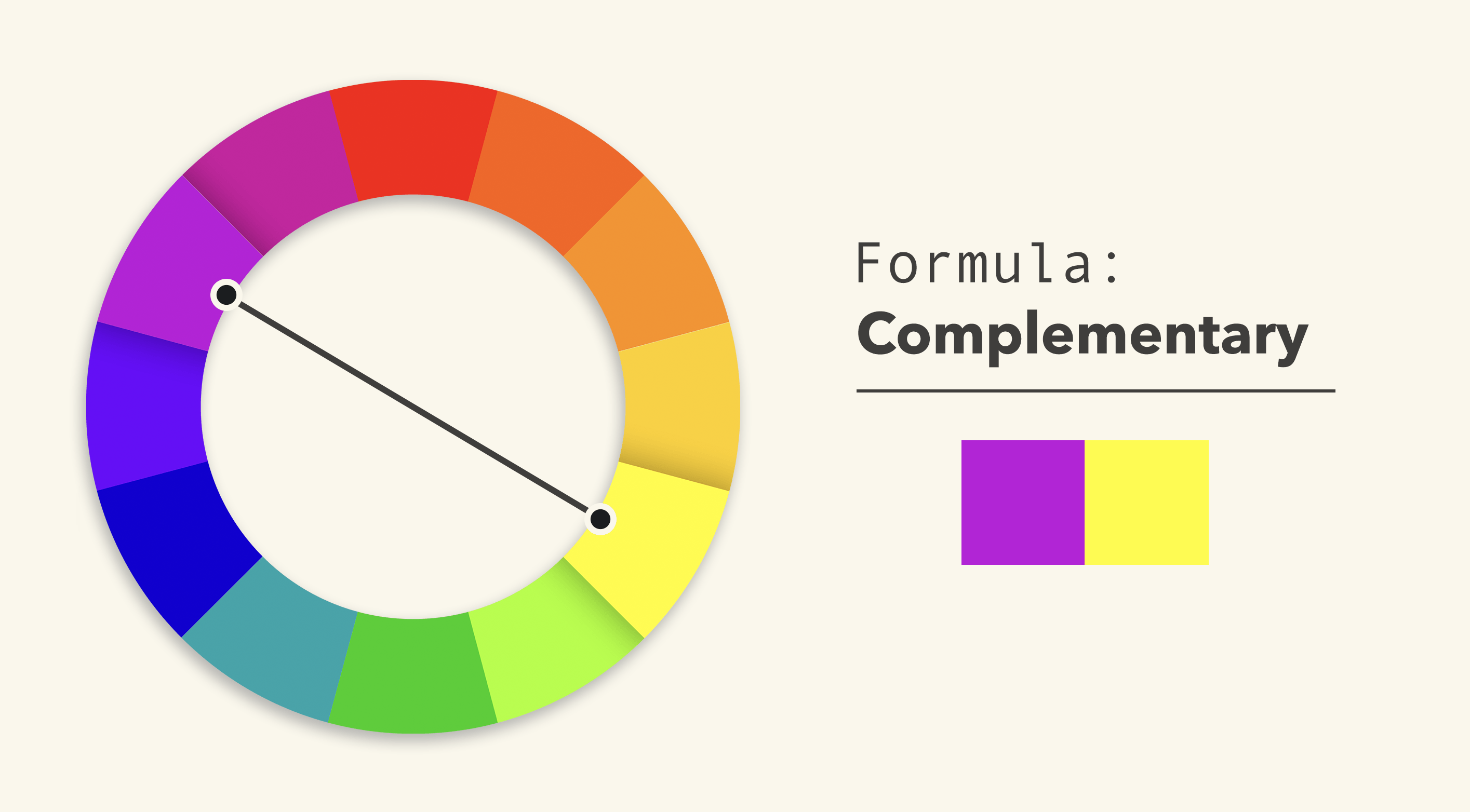
Complementary colors are two colors positioned opposite each other on the Color Wheel.
Examples:
- Purple and Yellow.
- Red and Green.
- Blue and Orange.
Characteristics: They create strong contrast, making interface elements stand out and attract attention.
Applications in UI/UX:
- Highlighting Call to Action (CTA) buttons.
- Creating focal points in promotional banners.
- Distinguishing interactive components from backgrounds.
- Establishing contrast between content sections.
Note: Avoid using two highly saturated complementary colors across large areas simultaneously, as this can cause visual fatigue.
B. Analogous Colors
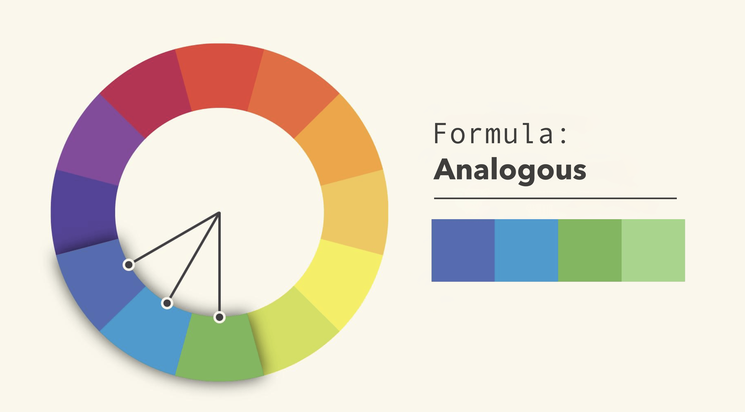
Analogous colors are positioned next to each other on the Color Wheel, typically involving two to four neighboring colors.
Examples:
- Blue, Cyan, Green.
- Yellow, Yellow-Orange, Orange.
- Red, Red-Orange, Orange.
Characteristics: They create a harmonious, subtle, and visually cohesive appearance.
Applications in UI/UX:
- Brand websites.
- Healthcare applications.
- Data dashboards.
- Interfaces requiring a professional and comfortable visual experience.
C. Monochromatic Colors
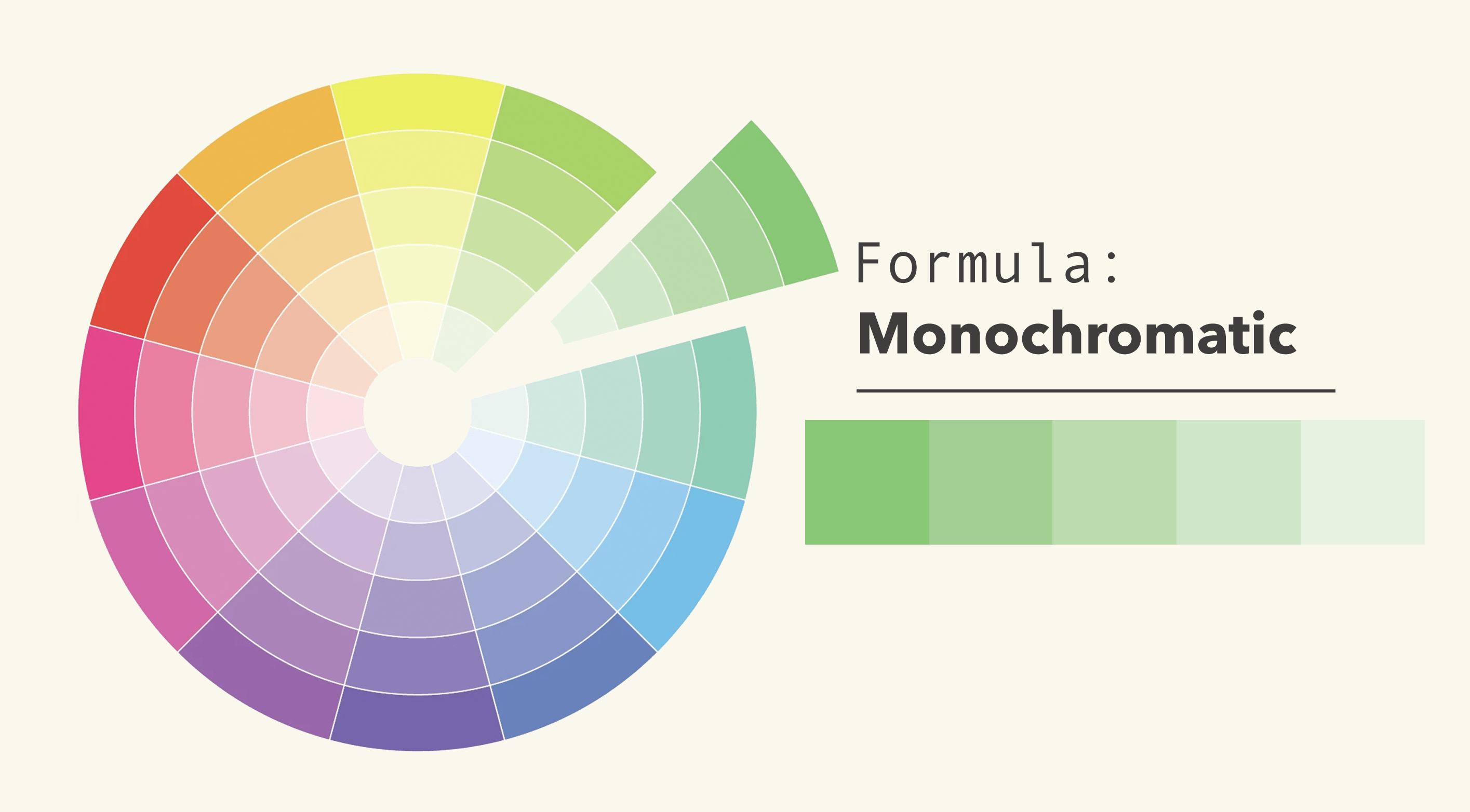
A monochromatic color scheme uses one dominant hue with variations in lightness and saturation.
For example, a blue palette may include very light blue, medium blue, dark blue, and navy.
Characteristics: It creates consistency, minimalism, and easier visual control.
Applications:
- Administrative dashboards.
- Technology websites.
- Enterprise applications.
- Interfaces requiring a clear visual hierarchy.
D. Triadic Colors
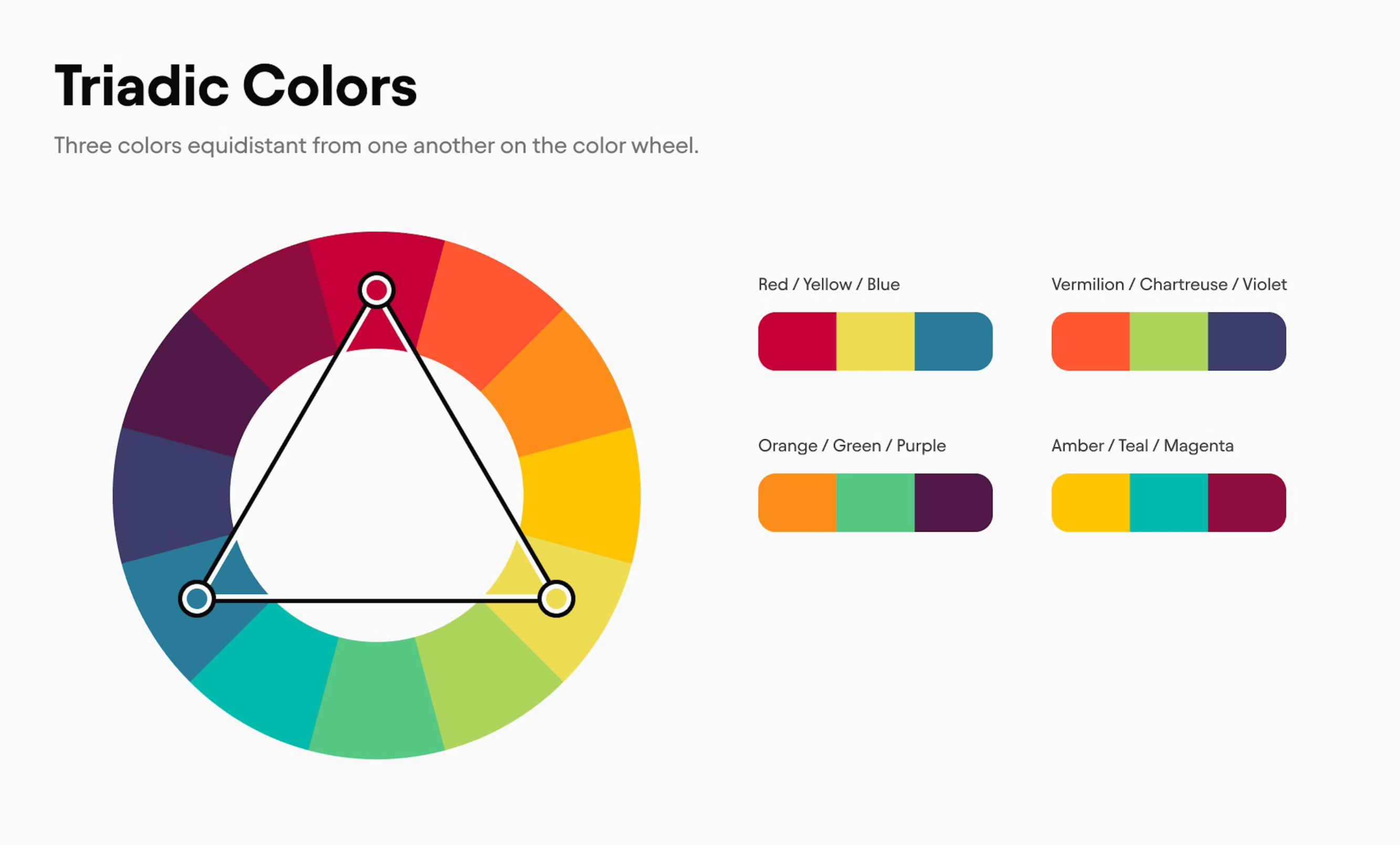
A triadic color scheme combines three colors evenly spaced around the Color Wheel.
Examples:
- Red, Yellow, Blue.
- Orange, Green, Purple.
Characteristics: It creates an energetic, diverse, and creative visual appearance.
Applications:
- Creative websites.
- Educational applications.
- Game UI.
- Interfaces designed for children.
However, it is generally recommended to select one dominant color and use the other two as supporting colors to prevent excessive visual competition.
2.3. Saturation, Brightness, and Hue — Three Essential Color Properties
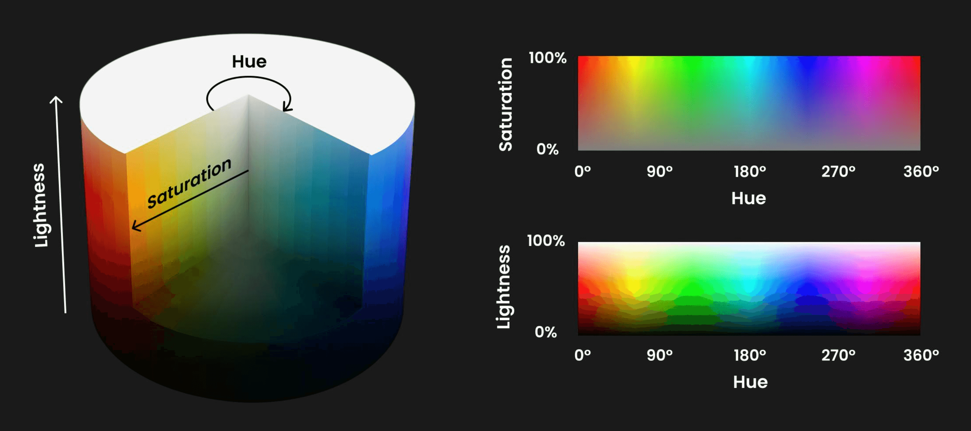
To effectively control colors in interface design, designers need to understand three fundamental properties:
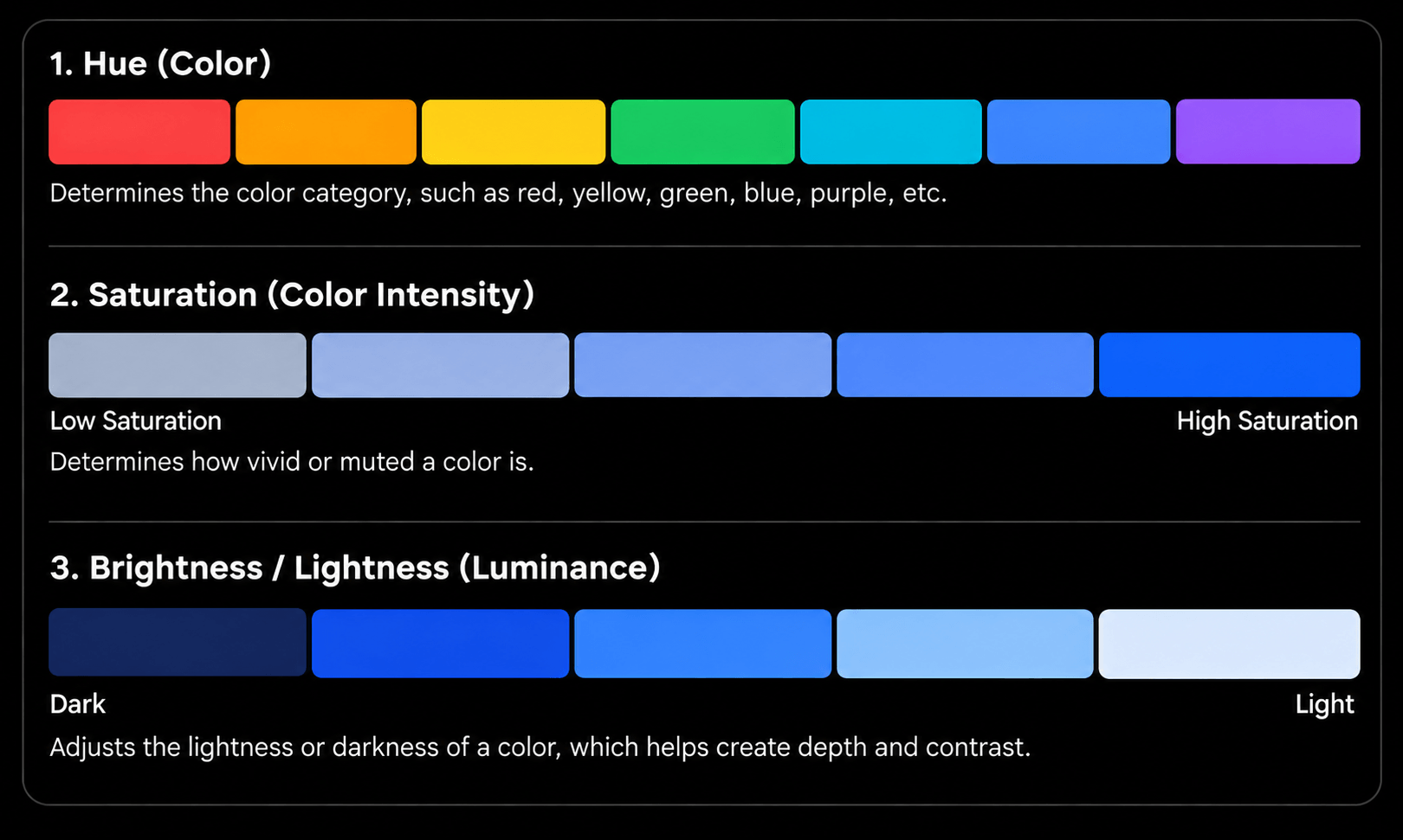
- Hue: The basic color we perceive, such as red, green, or blue.
- Saturation: The intensity or purity of a color. Highly saturated colors tend to stand out, while less saturated colors create a softer and more neutral appearance.
- Brightness / Lightness: The degree of lightness or darkness of a color. Lighter colors are often suitable for backgrounds and spacious layouts, while darker colors work well for typography, navigation, and visual depth.
A common mistake in UI design is using too many highly saturated colors. This causes interface elements to compete for attention and weakens the overall Visual Hierarchy.
3. Color Contrast
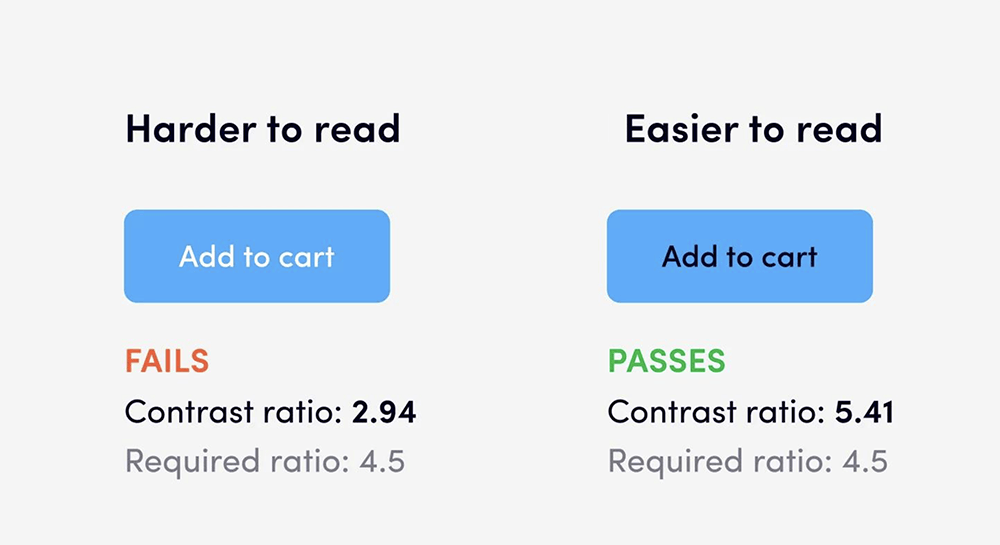
Color Contrast refers to the difference in brightness and color between two elements, commonly text and its background.
Good contrast helps:
- Improve content readability.
- Enable users to quickly identify functional buttons.
- Distinguish important interface elements.
- Support users with low vision or color vision deficiencies.
WCAG 2.2 Standards
According to the Web Content Accessibility Guidelines (WCAG), minimum contrast ratios for Level AA include:
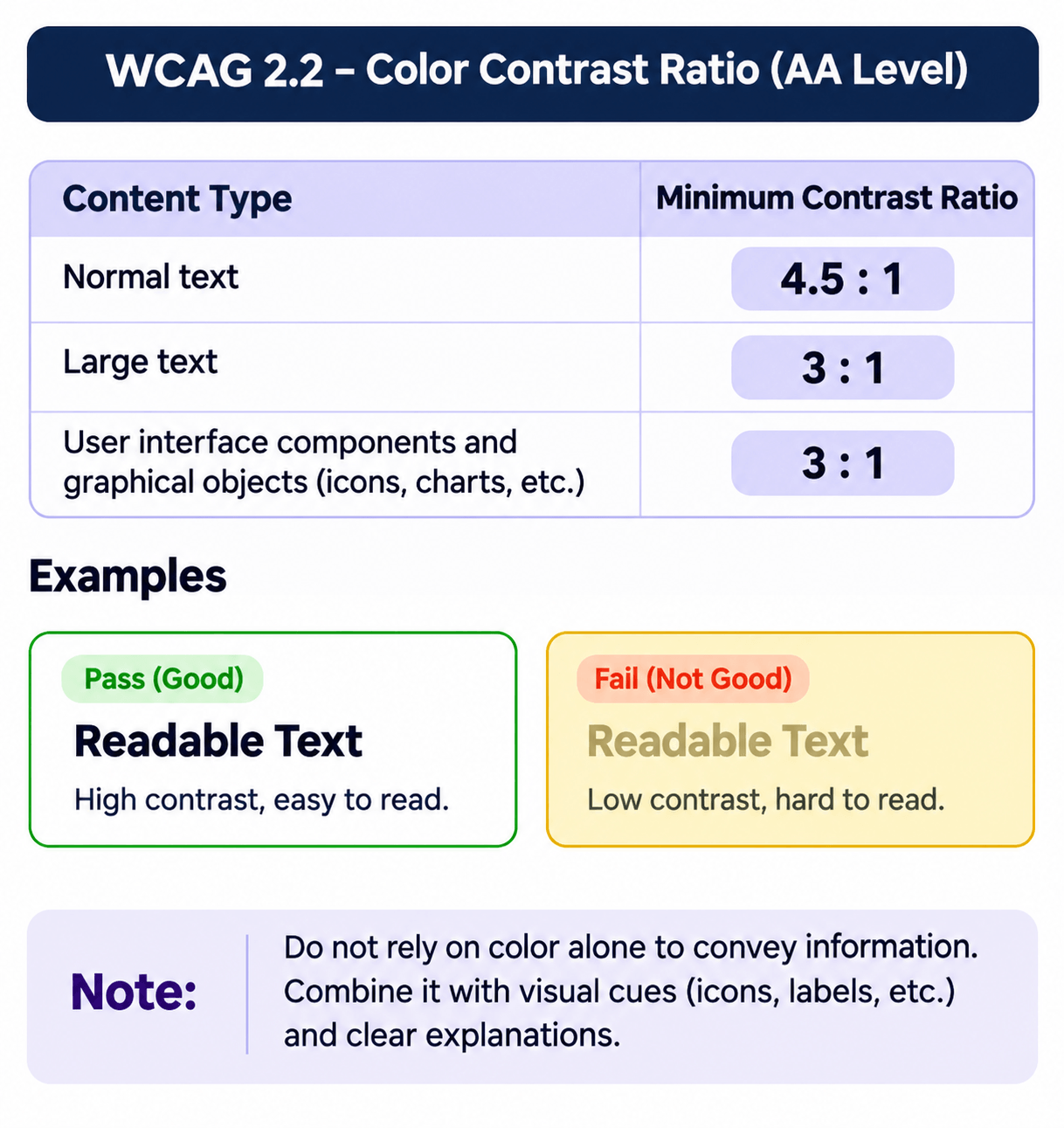
- Normal text: 4.5:1.
- Large text: 3:1.
- Non-text interface components and meaningful graphical elements: 3:1 where applicable.
For example, instead of relying solely on red to indicate an error, combine the color with a warning icon and explanatory text. This makes the interface more accessible to users with color vision deficiencies.
4. Color Psychology in Design
Colors can influence users' emotions, perceptions, and behaviors. In UI/UX design, color selection should reflect the brand message, context, and target audience.
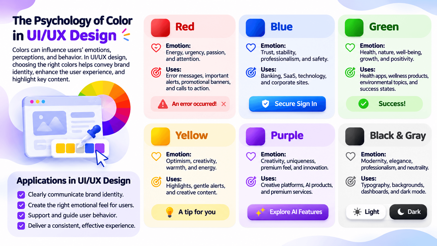
Note: Color associations are common tendencies rather than fixed psychological rules. The meaning of a color can vary depending on culture, industry, and context.
5. How Professional Designers Use Color in Websites and Applications
Professional designers do not select colors based solely on personal preference. Instead, they establish structured color systems aligned with brand identity, interface architecture, and user behavior.
5.1. Using Color to Establish Visual Hierarchy
Visual Hierarchy helps users identify which elements are most important.
For example, on an e-commerce website:
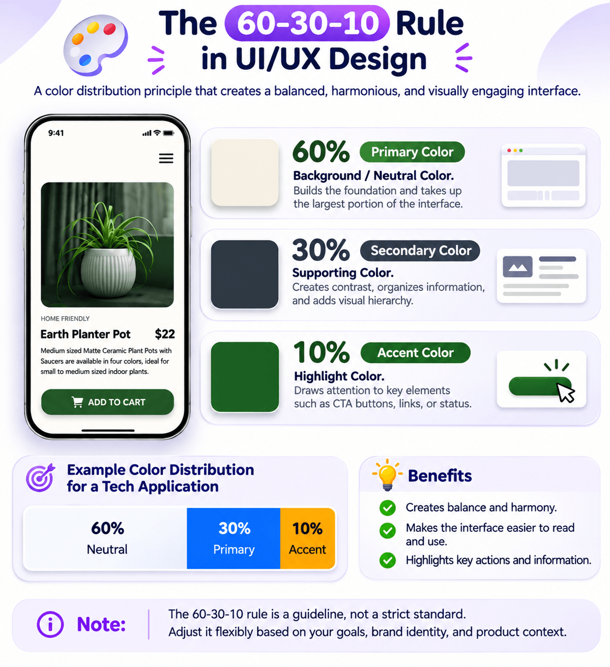
- Neutral colors are used for backgrounds.
- Dark colors are used for headings and body text.
- Brand colors are used for navigation and identity-related elements.
- Accent colors highlight important buttons such as Add to Cart or Buy Now.
An interface does not need numerous colors to attract attention. A single Accent Color, applied strategically, can create a strong visual impact.
5.2. Building a Color System Instead of Selecting Individual Colors
One professional approach is to establish a color system based on functional roles, also known as a Semantic Color System.
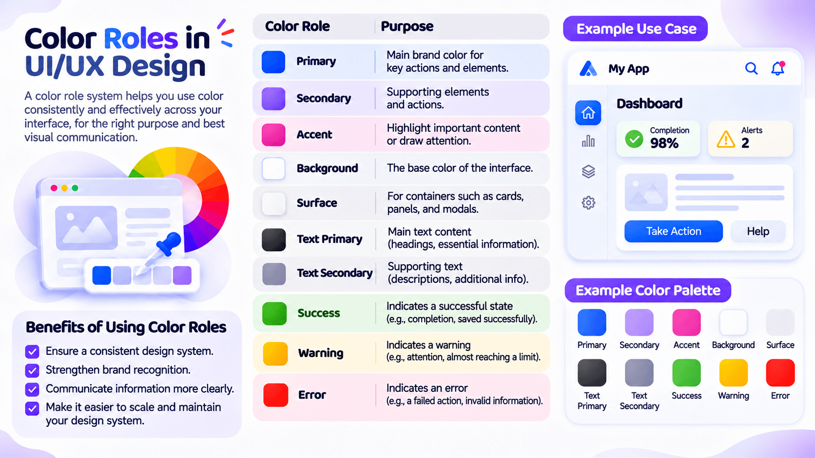
This approach ensures consistent color usage throughout the interface and makes future design updates easier.
It is also a fundamental principle used in Material Design and many modern Design Systems.
5.3. Designing Light Mode and Dark Mode

A professional application should maintain consistency across both display modes.
Light Mode:
- Light backgrounds.
- Dark typography.
- Distinctive Accent Colors.
- Suitable for brightly lit environments.
Dark Mode:
- Dark backgrounds.
- Light typography.
- Intermediate color levels to distinguish surfaces.
- Limited use of highly saturated colors across large areas.
Note: Dark Mode is not simply an inversion of white and black. Designers need to carefully adjust brightness, contrast, and colors for individual components.
6. Analyzing Good and Poor UI Design Examples
To better understand how Color Theory is applied, consider two interface design examples.
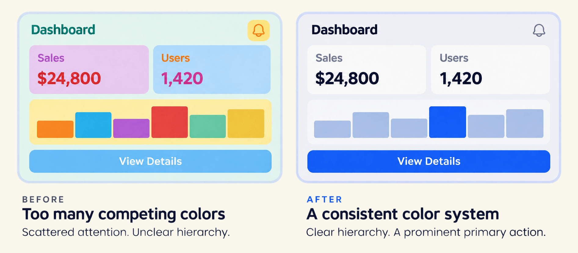
Left: Poor UI Design
- Too many colors competing for attention.
- Text and background colors are too similar.
- Accent Colors are overused across multiple components.
- No clear hierarchy between headings and body content.
- Inconsistent notification colors.
- Red and green are used to distinguish states without additional symbols.
Evaluation: The interface may be difficult to read, reduce functional clarity, and create an unprofessional user experience.
Right: Good UI Design
- A clearly defined primary color.
- Strong contrast between backgrounds and typography.
- Purposeful color usage.
- Important buttons are easily recognizable.
- Success, warning, and error states are clearly differentiated.
- Limited use of highly saturated colors.
Evaluation: The interface is consistent, readable, easy to navigate, and avoids visual overload.
7. Practical Guide: How to Build a Color Palette for UI/UX Design
This section focuses on transforming color theory into practical design decisions.
7.1. Start by Defining Design Goals
Before selecting colors, answer three essential questions:
- Who is the target audience?
- What emotions should the brand communicate?
- Should the interface feel professional, friendly, modern, or creative?
For example
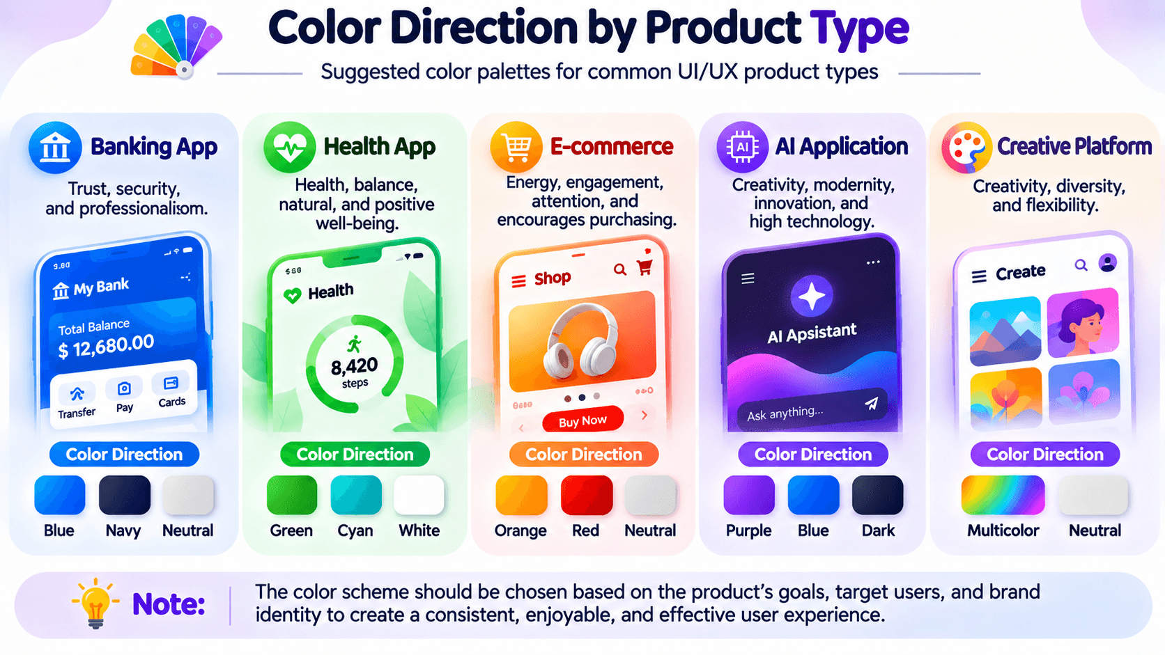
7.2. Apply the 60–30–10 Rule
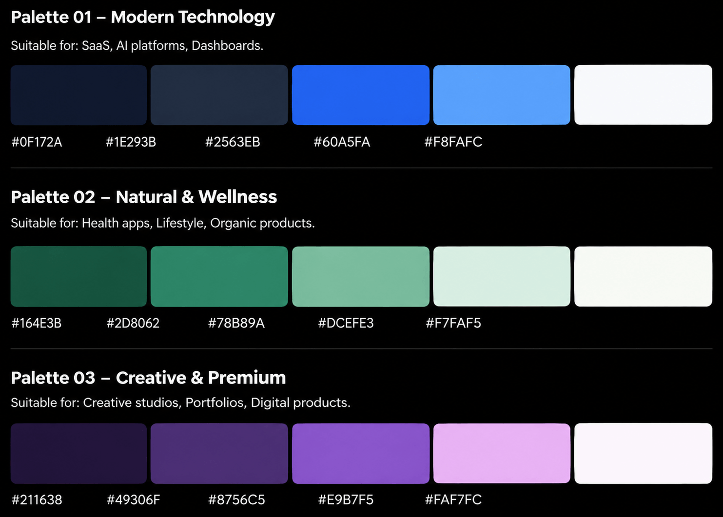
7.3. Three Practical Color Palettes
Below are three sample Color Palettes suitable for different product categories.
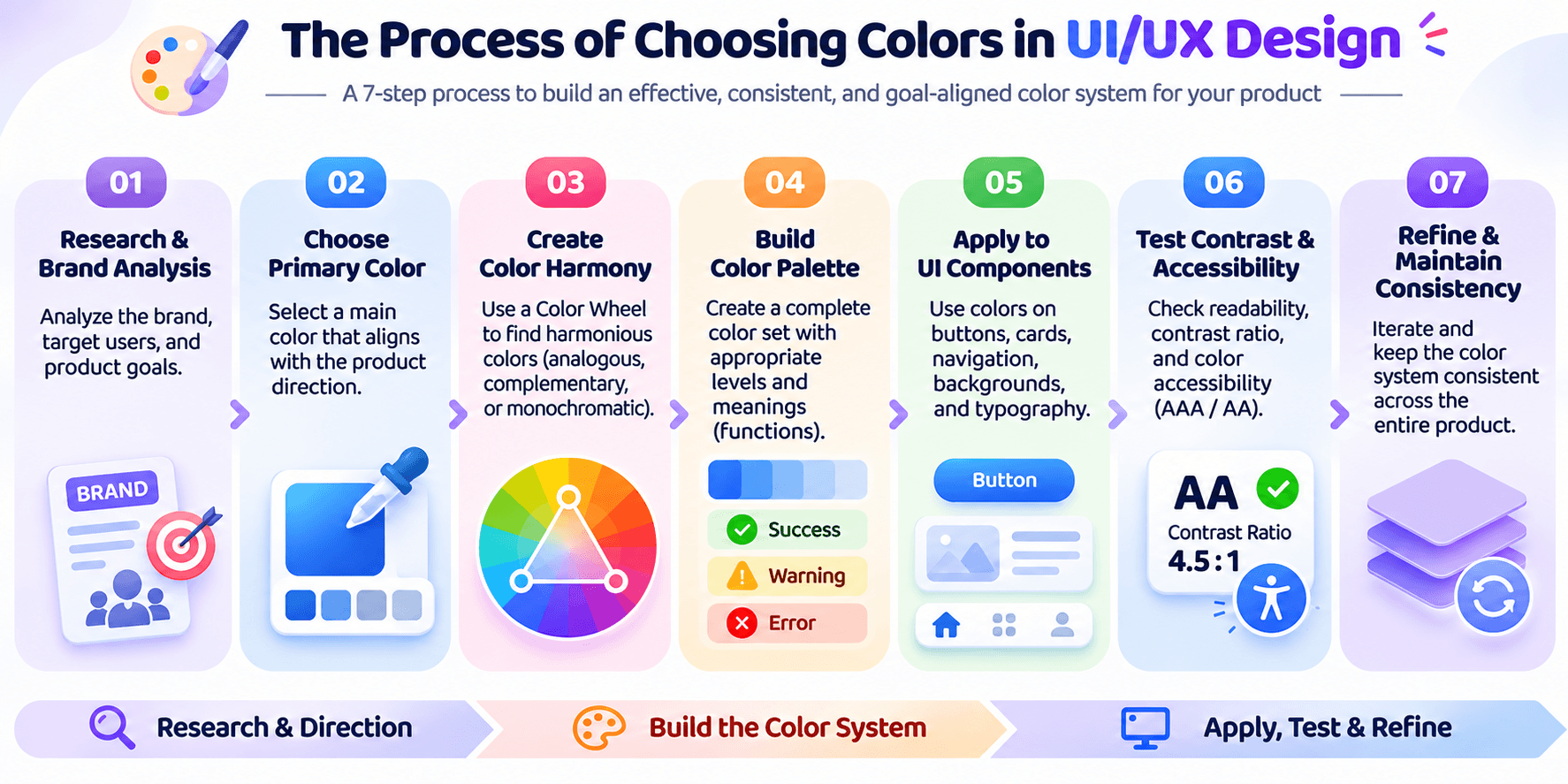
7.4. Color Selection Workflow for UI/UX Projects
The following process can be applied to most interface design projects.
8. Tools for Color Theory and UI/UX Design
Designers can use various tools to research, generate, and evaluate color palettes.
Adobe Color
Create color palettes using the Color Wheel, explore different color harmony schemes, and extract colors from images.
Website: https://color.adobe.com
Coolors
Quickly generate color palettes, explore harmonious color combinations, and export HEX codes.
Website: https://coolors.co
Figma
Build Color Styles, Variables, and Design Systems for UI/UX products.
Website: https://www.figma.com
WebAIM Contrast Checker
Check contrast ratios between text and background colors according to WCAG accessibility standards.
Website: https://webaim.org/resources/contrastchecker/
9. Applying Color Theory Across Different Design Disciplines
Color Theory is not limited to digital interface design. Principles such as Color Harmony, Saturation, Brightness, Contrast, and Color Psychology are widely applied in fashion, architecture, interior design, and product design.
Although each discipline has different objectives, color remains essential for defining visual styles, communicating emotions, establishing visual balance, and enhancing user experiences.
A practical example comes from a project I am currently working on: creating a 3D receptionist character capable of real-time communication within a virtual reception environment.
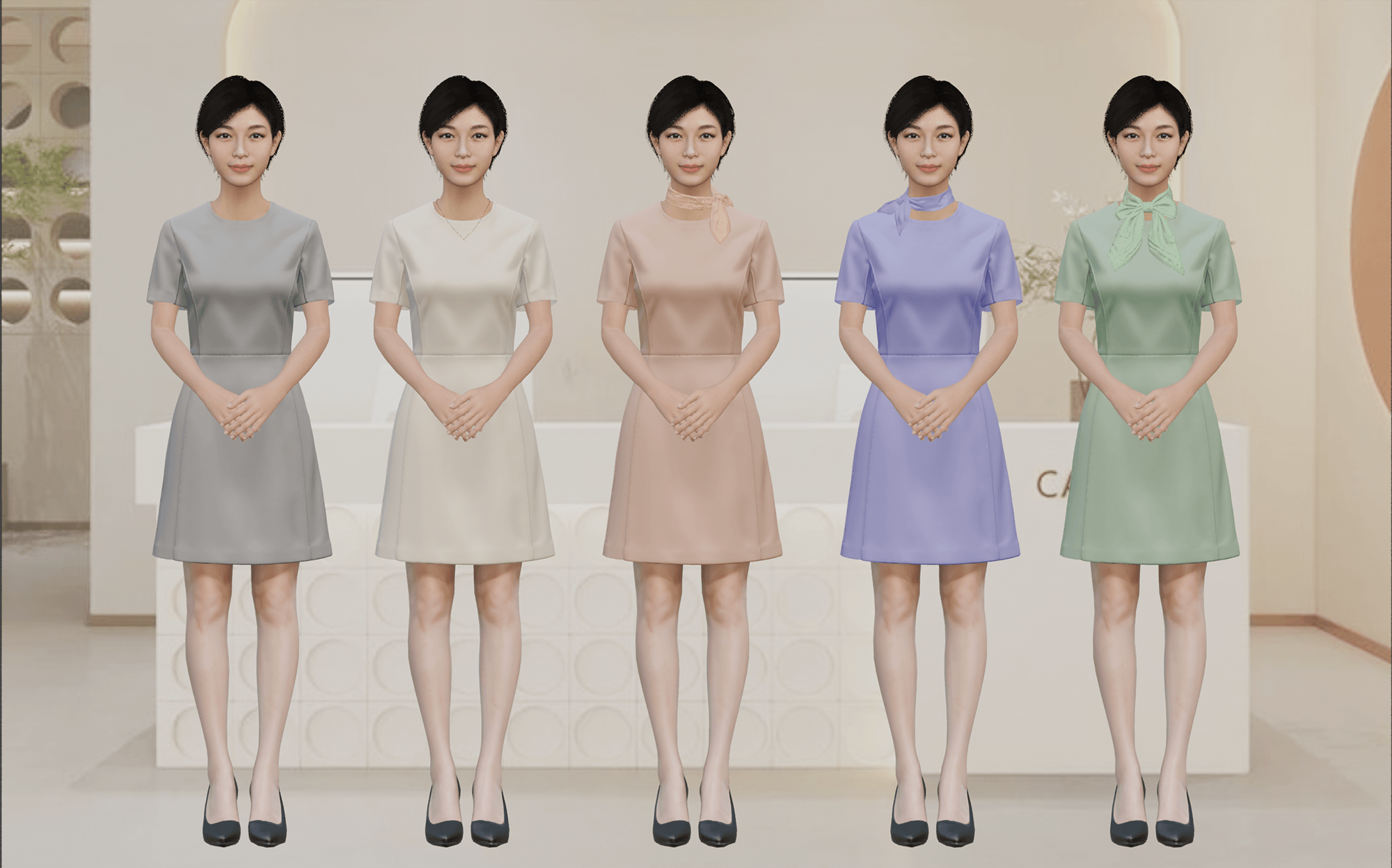
In character costume design, color plays an important role in defining personal style, expressing personality, and creating an emotional impression.
I often apply Color Harmony principles when selecting colors for clothing, accessories, supporting details, and the surrounding environment.
In this example, five 3D characters share the same outfit design but feature five different color palettes.
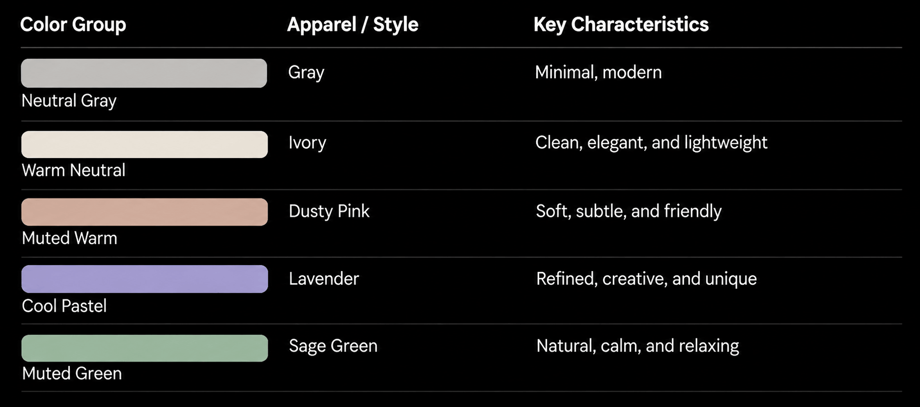
What makes this example particularly interesting is that all five outfits use relatively low saturation, relatively high brightness, and avoid excessively vivid colors.
This allows each outfit to have a distinct hue while maintaining overall visual consistency.
Color Harmony Analysis
- Gray and Ivory: Establish a connection through neutral tones.
- Dusty Pink: Introduces warmth and creates a softer overall appearance.
- Lavender: Adds a cool-toned accent.
- Sage Green: Brings a natural and balanced feeling.
This approach combines Warm Colors, Cool Colors, and Neutral Colors while maintaining consistent Saturation and Brightness.
Practical Takeaway: When designing character costumes, strong color contrast is not always necessary. Carefully controlling saturation, brightness, and color temperature can create a diverse collection while preserving a consistent brand identity.
Conclusion
Applying Color Theory to Improve UI/UX Design Quality
Color Theory is more than simply understanding how to combine visually appealing colors. It is a fundamental design discipline that helps designers create structured, user-friendly interfaces and communicate information effectively.
By understanding the Color Wheel, Color Harmony, Complementary Colors, Analogous Colors, Saturation, Brightness, and Color Contrast, designers can make more informed color decisions instead of relying entirely on intuition.
In practice, a successful interface does not necessarily require numerous colors or striking visual effects. What matters most is that every color serves a specific purpose, supports brand recognition, establishes Visual Hierarchy, and improves the user experience.
Key Takeaway: An effective color palette does more than make an interface visually appealing. It helps users understand information, recognize important elements, and interact with digital products more easily.
Struggling to turn ideas into reality? With a proven track record of over 1,000 clients, our agile and flexible team will accelerate your business growth.